BizPortals Spotlight
BizPortals Spotlight enables you to do following –
- We can display information related to those events that are worth knowing about or that create a positive impact on the organization.
- We can display welcome messages for new employees or information about outstanding performances.
- You might also add any other news that users may need to focus on like upcoming activities, meetings, or any significant news that requires attention from the organization.
Notes:
- Only users with site owner or higher privileges can add new BizPortals Spotlight.
- Users with the “Member” permission level or higher can create, read, update, and delete items in the web part (CRUD operations). Conversely, visitors can only see the items that have been created in the web part, but they cannot modify or delete them.
- The layout of this web part may vary depending on the layout option applied by the site owners.
- Site owners can set a limit on the number of items that can be displayed on the web part display.
- Site owners can choose to display header style/image by selecting the header layout in the webpart layout settings configuration.
2. Web part Configuration
2.1 Overview
You can change the title of this web part, add a description of the web part, change the layout, set the web part height, apply custom theme, show/hide the web part title and other configurations.
Note – You must have at least the site owner’s permission to configure this web part and site collection administrator permission to associate with new list.
Follow the steps mentioned below,
- Navigate to the top right corner of the page and click the edit button.
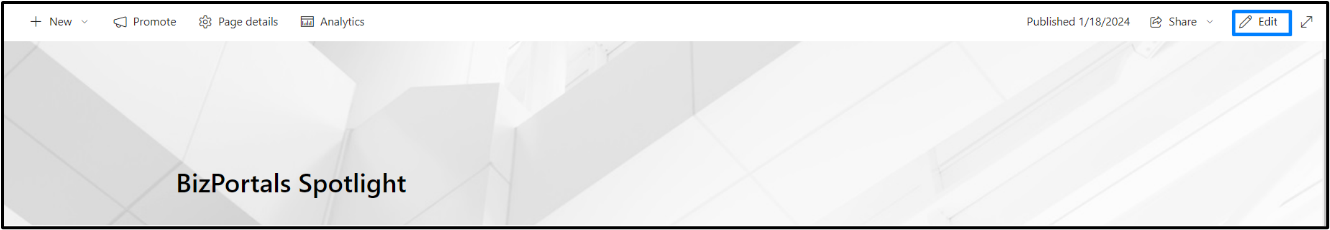
- Then click on the edit web part icon as shown in the below image.
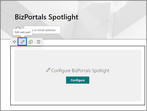
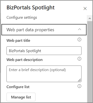
- After clicking on the edit web part icon, the property panel will be shown for this web part on the right side.
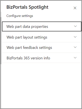
2.2 Web Part Data Properties
2.2.1 Web Part Title
It is the name that shows in the header of the web part that summarizes the web part’s function.
2.2.2 Web Part Description
This is the brief information related to the web part which can highlight what is the functionality of the web part.
2.2.3 Configure/Manage list
Manage List button field is a configuration feature within the web part that facilitates the organization and storage of items, specifically spotlight stories.
When you click on manage list button, following are the options shown –
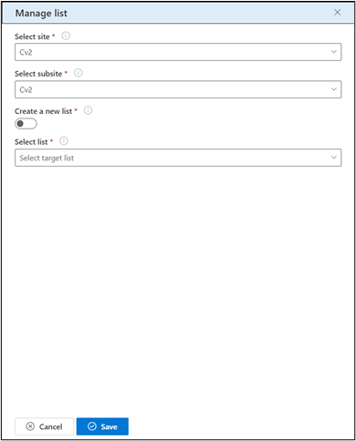
2.2.3.1 Select Site
- Choose a site from the dropdown menu where you want to store the spotlight stories. This defines the primary location within the SharePoint environment.
2.2.3.2 Subsite
- Specify a subsite under the selected site, further refining the storage location for the spotlight stores.
Note: This is an optional choice. Users can also configure spotlight stories on the root site.
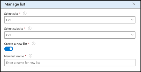
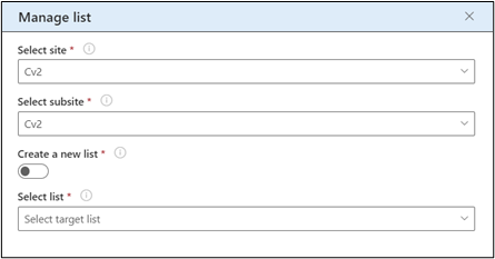
2.2.3.3 Create a New List
- Toggle this option to decide whether to create a new list for storing spotlight stories. If activated, an additional field for entering the new list name will be displayed. If deactivated, the option to select an existing list becomes available.
2.2.3.4 New List Name
- Appears when the “Create a New List” option is selected. Users can input a unique name for the new list where they want to store items (spotlight stories) created in this web part.
2.2.3.5 Select List
- Use this option to choose an existing list from which you want to associate spotlight stories.
2.2.3.6 Access Backend Spotlight Library
To access the backend picture library created for the BizPortals Spotlight On web part, use the following URL format:
<YourSite/SiteCollectionURL/><YourLibraryName>/
Replace <YourSite/SiteCollectionURL> and <YourLibraryName> with your specific site collection and library details.
2.2.4 Number of records to show
Number of records that can be shown on the web part display. At max, 50 records can be displayed on the web part and these records will be shown according to the sorting criteria you apply in “Display items based on” and “Order items in” field.
2.2.5 Display items based on
Users can choose items based on the provided options as shown in the below image.
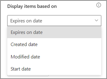
Expires on date – If this option is selected, the items are displayed on the web part display according to the expires on field that is shown while creating a new headliner item.
Created date – If this option is selected, the items are displayed on the web part display according to when you have created a headliner item.
Modified date – If this option is selected, the items are displayed on the web part display according to when the last headliner item was modified.
Start date – If this option is selected, the items are displayed on the web part display according to the starts on field that is shown while creating a new headliner item.
2.2.6 Order items in
This field determines the arrangement of items within the web part display.
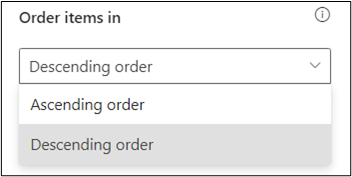
Choose the order as shown in the below image that best suits your viewing preferences based on the criteria selected from “ Display items based on ” field.
Ascending order – Items will be sorted from earliest to latest.
Descending order – Items will be sorted from latest to earliest.
Note – “ Display items based on ” and “Order items in” field work together with each other. For instance, if you select “Expires on date” option from the “Display items based on ” field and “Ascending order” from “Order items in” field, the headliner items that will expire first will be shown first on the web part display.
By default, items displayed based on Expires on date and ordered in descending order.
2.2.7 Set default image
It allows users to establish a predefined image that the system will automatically assign to a Spotlight Story when no image is uploaded during a new item’s creation.
Note: When you set an image, the focus will automatically adjust to fit the size of the web part
2.2.8 Reset to system default image
It provides users with the option to revert to the default background image specified by the system. This feature is useful when a user decides not to upload a custom background image in the “Set Default Image” field, allowing them to easily return to the system’s predefined default background.
2.2.9 Show border
To display a border around the web part, users should activate the toggle button in the property pane. Once enabled, a 1pt border will be applied to the web part shown in the image below
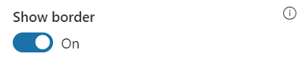
Note: Recommended size 400 w x 350 h. Accepted formats: jpg, jpeg, bmp, gif, png
2.3 Web Part Layout Settings
2.3.1 Select header layout
Users can change the web part header layout. There are six options to choose from. The sixth option allows you to set an image in the web part title. When you select the sixth option in the panel layout, a URL field will automatically appear next to the panel layout option. Users can enter an image URL to display on the panel. If you leave the field blank and click ‘Apply,’ it will use a default image.
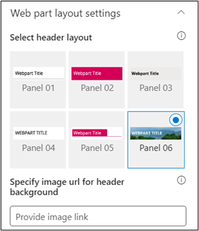
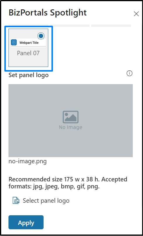
When you select panel layout 7 user should be able to configure logo for web part header, the size for that image will be (175*38)
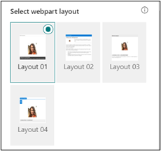
2.3.2 Select Web Part Layout
Users can select the web part layout by selecting from the available options.
2.3.3 Set duration (in milliseconds)
This option is tailored for carousel within the BizPortals Spotlight web part. Using a slider, users can define the time interval in milliseconds that elapses before a new entry is presented on the web part display.
2.3.4 Web Part Height (px)
Users can set the web part height by sliding the range bar according to the requirement.
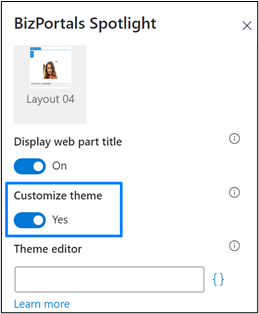
2.3.5 Display Web Part Title
Enable this toggle button if you want to display the title in the header of the web part. Keep this toggle button in disabled state if you want to hide the title in the header of the web part.
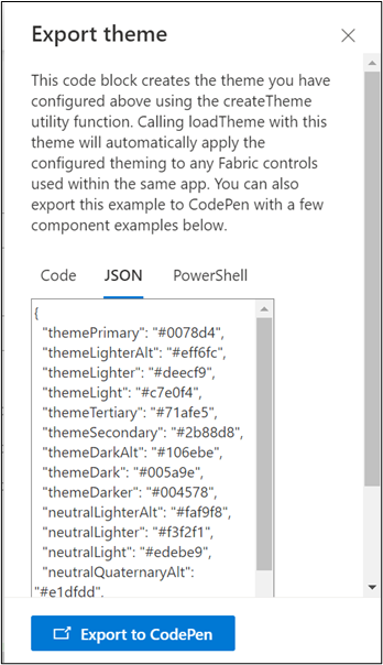
2.3.6 Customize Theme
Users can enable this option to personalize the web part’s visual appearance by applying a custom background theme. This is achieved by entering a JSON (JavaScript Object Notation) code into the theme editor as shown in below image. The JSON configuration includes parameters such as text color, background color, and other styling options to tailor the look and feel of the web part according to individual preferences.
- Click” Learn more” to visit the Fluent UI Theme Designer website.
- Customize your theme by selecting your preferred primary, text, and background colors. Once satisfied, click Export theme.
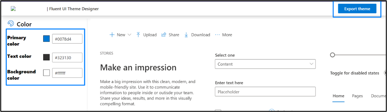
- To apply the theme settings, copy the JSON code and paste it into the designated area of the Theme Editor (Customize theme field). Click Save.
2.3.7 Web Part Height (px)
Users can set the web part height by sliding the range bar according to the requirement.
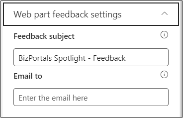
2.4 Web Part Feedback Settings
Feedback subject: This determines the subject line of the email sent when users submit any feedback related to the web part.
Email To: This field designates the recipient’s email address to whom feedback-related emails will be sent. When a user submits feedback through the web part, an email notification is generated and directed to the email address specified in this field.
Note: Feedback recipient must have access to this site collection.
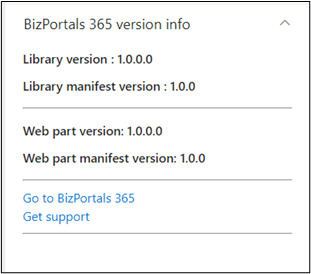
2.5 BizPortals 365 Version Info
Here user can see the version information.
3. Web part Functionality
3.1 Add a new spotlight story
Users with site members and above permissions can do the following:
To add a new spotlight story on any site, do the following:
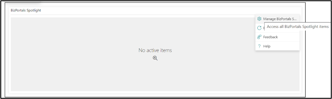
- On the BizPortals Spotlight web part, hover the cursor on the top right corner. The menu icon is displayed. Click it.
- From resulting dropdown, select “Manage BizPortals Spotlight”. Refer to the below image.
- In the resulting screen, click “New” to add a new spotlight story.
- In the resulting new entry form, provide the following information:
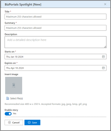
Title: Add a title that that grabs attention and summarizes the key message of your content. This is shown to all the users on the web part display.
Summary: It is a description box where users can provide a brief overview or summary of the content they are showcasing. This is shown to all the users on the web part display.
Description: You can enter a detailed information about the content of the Spotlight Story.
Starts on: This is the date on which the spotlight story starts showing to the users on the web part display.
Expires on: Set a Time Limit for Your spotlight story. The “Expires On” field lets you decide when a spotlight story should automatically disappear from the web part display. The default expiry date is set at three months, but you can customize it.
Insert Image: Click the Select files button and thereby browse and upload an image.
Enable story: To publish the spotlight story, select the ‘Enable’ option. If enabled, the spotlight story will be shown to all the users on the web part display. Keep it disabled if you want to review it later or don’t want to publish it now. The disabled items will be shown on the grid where all the items are stored but will not be shown on the web part display.
Note:
- Fields marked with a red asterisk are mandatory. You must provide details for them to create a story.
- A given story is visible until the chosen expiration date.
- You can preview the image you are uploading in the image field.
- After filling out all the required information, click on the ‘Save’ button.
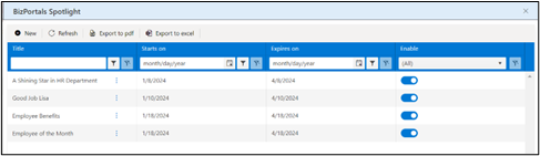
3.2 Enable /Disable Spotlight Story
- On BizPortals Spotlight web part, hover the cursor on the top right corner. The menu icon () is displayed. Click it.
- From resulting dropdown, select “Manage BizPortals Spotlight”.
- In the resulting screen, list of spotlight stories is displayed.
- Enable/disable the saved spotlight stories.
3.3 View details of a Spotlight Story
- Locate the BizPortals Spotlight web part on your SharePoint site.
- Identify the spotlight story you want to view.
- Click on the title or a designated area of the spotlight story you want to explore in detail.
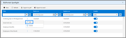
3.4 Edit a Spotlight Story
- On BizPortals Spotlight web part, hover the cursor on the top right corner. The menu icon () is displayed. Click it.
- From resulting dropdown, select “Manage BizPortals Spotlight”.
- In the resulting screen, click on the context menu ().
- Select Edit.
- In the resulting screen, make the necessary changes.
- Click Save.
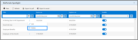
3.5 Delete a Spotlight Story
- On BizPortals Spotlight web part, hover the cursor on the top right corner. The menu icon () is displayed. Click it.
- From resulting dropdown, select “Manage BizPortals Spotlight”.
- In the resulting screen, click on the Context Menu ()
- Select Delete.
- You will be asked to confirm the action. Click ok.
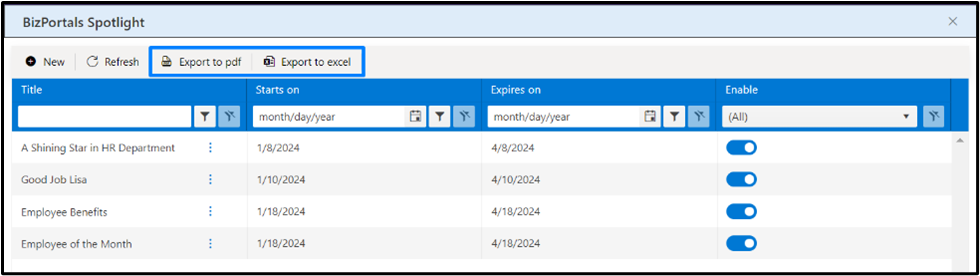
3.6 Export list of Spotlight Stories
- On BizPortals Spotlight web part, hover the cursor on the top right corner. The menu icon () is displayed. Click it.
- From resulting dropdown, select “Manage BizPortals Spotlight”.
- In the resulting window, Click the Export to PDF icon for exporting the list to a file in PDF format.
- Click the Export to Excel icon for exporting the list to a spreadsheet.
- A list in the desired format is downloaded.