
BizPortals Chat
BizPortals Chat web part enables you to do following –
- It allows the logged-in user to chat with their coworkers. These conversations can be one-on-one or with groups.
- The chats are always in sync with the logged-in user’s Microsoft Teams account. To use this feature, you should either be a registered Office 365 user or be added by a Power User on the Microsoft Teams site.
- Each conversation includes the name of the group or user you are chatting with and displays the date and time of the sent message.
- The web part auto-refreshes, thus pushing the latest message for the logged-in user.
Notes:
- All the users irrespective of the permissions they have on the site can use BizPortals Chat web part.
- You can initiate a new conversation with a new user or group from this location.
- Clicking on the group title or any user’s name will take you to the Microsoft Teams site.
- To view the complete conversation of a group, simply click on the ‘View Conversation’ button located just below the group title.
- For chats exceeding the 253-character limit, there will be options to ‘expand’ and ‘collapse.’ This feature helps users read the full text.
- All the team’s attachments will be visible, but you cannot add new attachments from here.
- Users can view or hide the conversation
- The date and time of message will also be visible on the chat.
- Deleted messages from MS team application should also be deleted from BizPortals Chat webpart.
Reply to a message
- The topmost message, which is also the latest message, is accompanied by a ‘Reply’ button.
- Clicking on it opens a text box, allowing you to enter your message. Every new message is added to the top of the group’s or user’s conversation stack.
2.Web part Configuration
You can change the title of this web part, add a description of the web part, change the header layout, set the web part height, apply custom theme, show/hide the web part title, and other configurations.
Note – You must have minimum owner’s permission to configure this web part.
Follow the steps mentioned below,
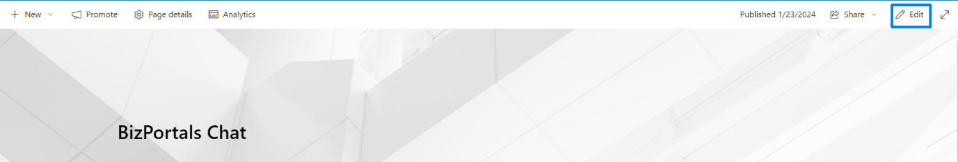
- Navigate to the top right corner of the page and click the edit button.
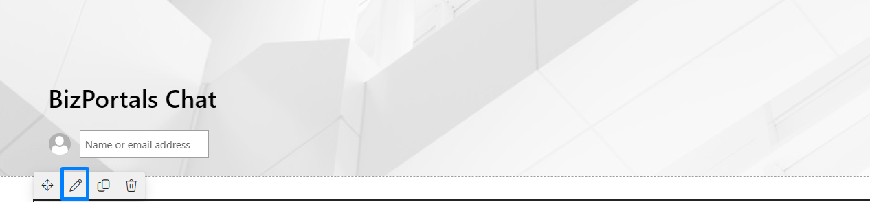
- Then click on the edit web part icon as shown in the below image.
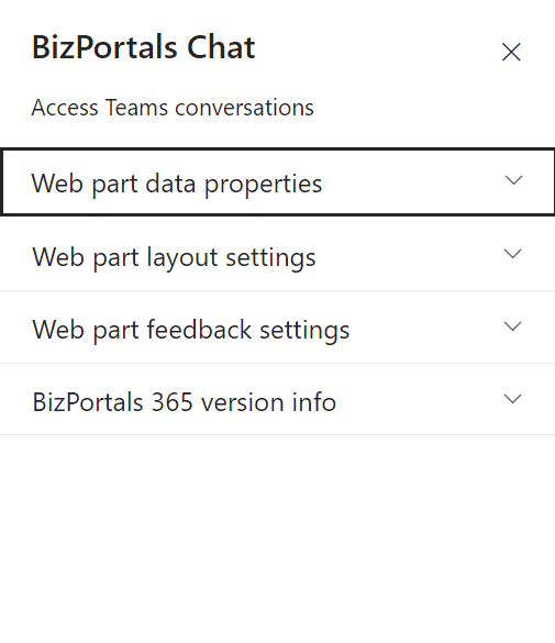
- After clicking on the edit web part icon, the property panel will be shown for this web part on the right side.
2.1 Web Part Data Properties
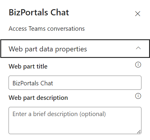
2.1.1 Web Part Title
It is the name that shows in the header of the web part that summarizes the web part’s function.
2.1.2 Web Part Description
This is the brief information related to the web part which can highlight what is the functionality of the web part.
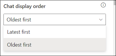
2.1.3 Chat display order
The latest messages are displayed at the top by default. Users can select the order of chat from the drop-down menu
2.2 Web Part Layout Settings
2.2.1 Select header layout
Users can change the web part header layout. There are six options to choose from. The sixth option allows you to set an image in the web part title. When you select the sixth option in the panel layout, a URL field will automatically appear next to the panel layout option. Users can enter an image URL to display on the panel. If you leave the field blank and click ‘Apply,’ it will use a default image.
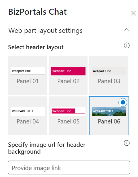
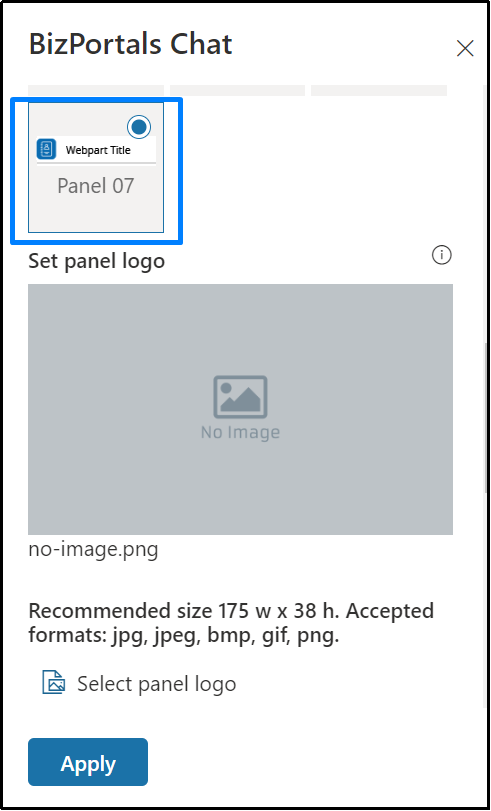
When you select panel layout 7 user should be able to configure logo for web part header, the size for that image will be (175*38)
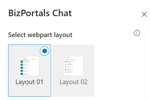
2.2.2 Select Web Part Layout
Users can select the web part layout by selecting from the available options.
2.2.3 Web Part Height (px)
Users can set the web part height by sliding the range bar according to the requirement.
2.2.4 Display Web Part Title
Enable this toggle button if you want to display the title in the header of the web part. Keep this toggle button in disabled state if you want to hide the title in the header of the web part.
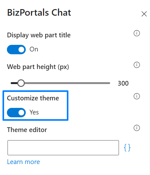
2.2.5 Customize Theme
Users can enable this option to personalize the web part’s visual appearance by applying a custom background theme. This is achieved by entering a JSON (JavaScript Object Notation) code into the theme editor as shown in below image. The JSON configuration includes parameters such as text color, background color, and other styling options to tailor the look and feel of the web part according to individual preferences.
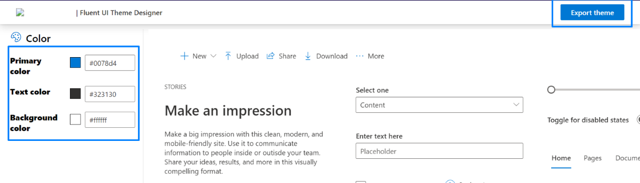
- Click” Learn more” to visit the Fluent UI Theme Designer website.
- Customize your theme by selecting your preferred primary, text, and background colors. Once satisfied, click Export theme.
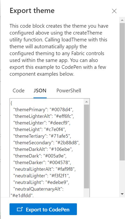
- To apply the theme settings, copy the JSON code and paste it into the designated area of the Theme Editor (Customize theme field). Click Save.
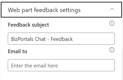
2.3 Web Part Feedback Settings
Feedback subject: This determines the subject line of the email sent when users submit any feedback related to the web part.
Email To: This field designates the recipient’s email address to whom feedback-related emails will be sent. When a user submits feedback through the web part, an email notification is generated and directed to the email address specified in this field.
Note: Feedback recipient must have access to this site collection.
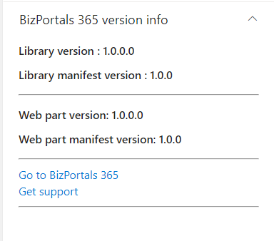
2.4 BizPortals 365 Version Info
Here user can see the version information.
Web part Functionality
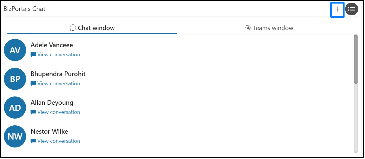
3.1 Chat Window
- When you start a chat in Microsoft Teams, you can find all those chats in the BizPortals chat webpart, whether it’s a group chat or a one-on-one conversation.
- To check out the entire conversation, just click on the “View conversation” button.
- After clicking the button, a text box appears where you can type a message to send to the users. The newest messages are shown at the top.
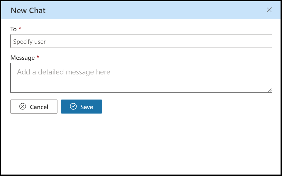
- To start a new chat, click the plus (+) icon in the chat window tab, as shown in the image below.
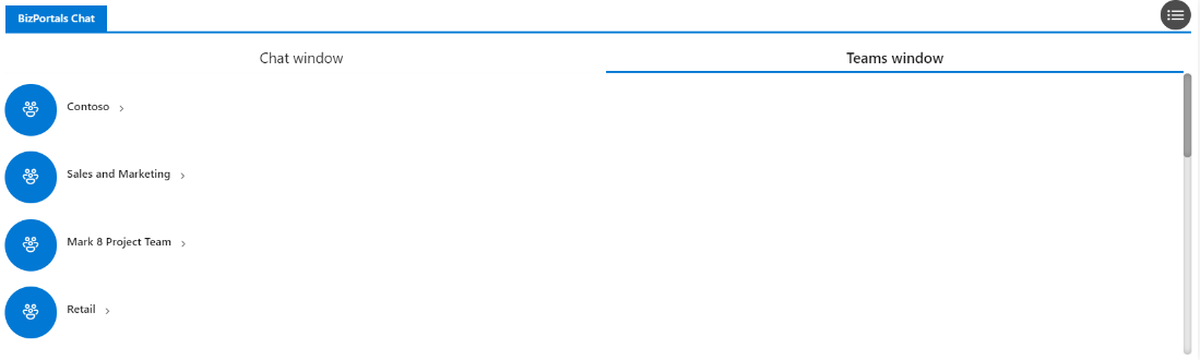
3.2 Teams Window
- This tab contains conversations between teams and channels.
- Each team is displayed row-wise in the web part, followed by an arrow icon. Clicking on the arrow icon expands to reveal the channels within that team.
- To reply to a message, navigate to a channel within a team and use either the ‘Reply’ button or the text box to send your message. If you use the ‘Reply’ button, your message will appear below the message to which you replied.
- If you use the text box which is shown at the top when you view a channel, your message will be placed at the top of the channel.
In layout 2, when users go into a user’s chat, they’ll see a people icon at the top. If they tap on the people icon, it acts like a back button, taking them back to where they can see all the chats again.