
BizPortals Locations
BizPortals Locations enables you to do the following:
- Location Viewer enables you to display the locations on a map in a webpart display.
- Customize the web part interface via custom theme, header layouts, height etc.
- Specify location at the SharePoint list and associate it with this webpart.
Notes:
- Only users with site owners or higher privileges can add new BizPortals locations webpart.
- Users with site owners or higher privileges can choose to display header style/image by selecting the header layout in the webpart layout settings configuration.
2. Web part Configuration
2.1 Overview
You can change the title, add a description of the web part, change the header layout, set the web part height, apply custom theme, show/hide the web part title, manage topics and other configurations.
Note – You must have at least the site owner’s permission to configure this web part and site collection administrator permission to associate with new list.
Follow the steps mentioned below,
- Navigate to the top right corner of the page and click the edit button.
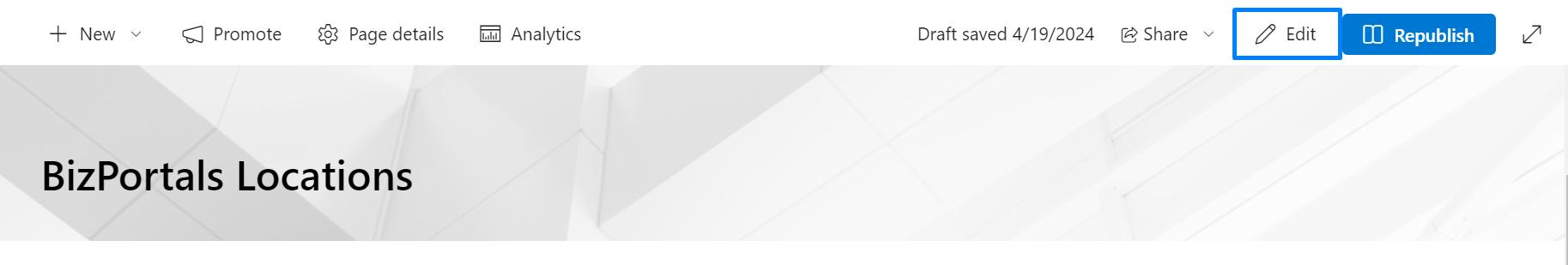
- Then click on the edit web part icon as shown in the below image.
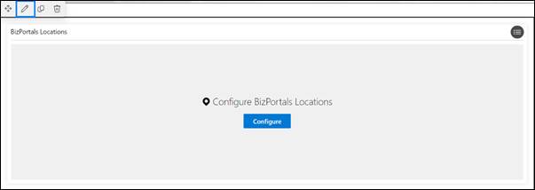
- After clicking on the edit web part icon, the property panel will be shown for this web part on the right side.
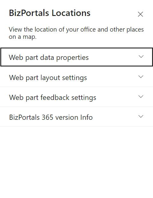
2.2 Web Part Data Properties
2.2.1 Web Part Title
It is the name that shows in the header of the web part that summarizes the web part’s function.
2.2.2 Web Part Description
This is the brief information related to the web part which can highlight what is the functionality of the web part.
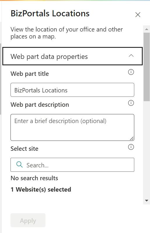
2.2.3 Select site
Choose/search a site from this option where you want to store the locations.
2.2.4 Select location list
Use this option to choose an existing list from which you want to associate locations.
2.2.5 Number of records
The number of links or records that can be displayed in the web part.
2.2.6 Google map key
Enter the key of the google map here. (Click here) option user will redirect to google map key creation site.
2.2.7 Default zoom level (max 25)
Zoom level defines the scale to which location map is displayed. Use the slider to set the zoom level.
2.2.8 Show border
To display a border around the web part, users should activate the toggle button in the property pane. Once enabled, a 1pt border will be applied to the web part.
2.3 Web Part Layout Settings
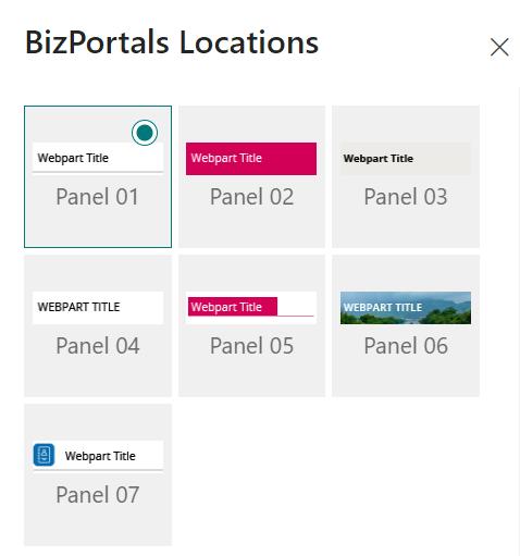
2.3.1 Select header layout
Users can change the web part header layout. There are several options to choose from. One option allows you to set an image in the web part title. When you select this option in the panel layout, a URL field will automatically appear next to the panel layout option. Users can enter an image URL to display on the panel. If you leave the field blank and click ‘Apply,’ it will use a default image.
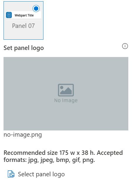
2.3.2 Select Panel Logo
In this feature user should be able to configure logo for web part header, the size for that image will be (175*38) as shown in the image below for this user needs to select last panel layout.
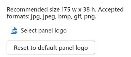
2.3.3 Reset to Default Panel Logo
It provides users with the option to revert to the default panel logo image specified by the system. This feature is useful when a user decides not to upload a custom logo image in the “Set panel logo” field, allowing them to easily return to the system’s predefined default background.
2.3.4 Display Web Part Title
Enable this toggle button if you want to display the title in the header of the web part. Keep this toggle button in disabled state if you want to hide the title in the header of the web part.
2.3.5 Web Part Height (px)
Users can set the web part height by sliding the range bar according to the requirement.
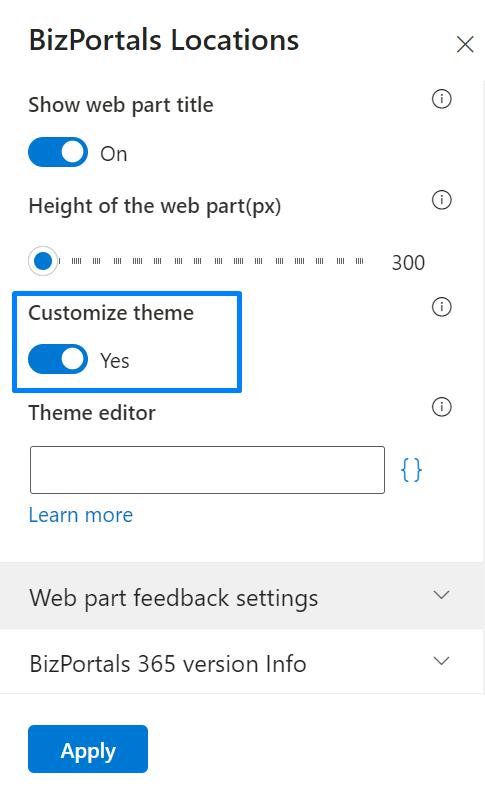
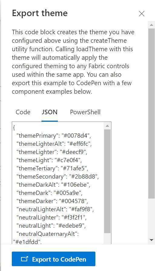
2.3.6 Customize Theme
Users can enable this option to personalize the web part’s visual appearance by applying a custom background theme. This is achieved by entering a JSON (JavaScript Object Notation) code into the theme editor as shown in below image. The JSON configuration includes parameters such as text color, background color, and other styling options to tailor the look and feel of the web part according to individual preferences.
- Click” Learn more” to visit the Fluent UI Theme Designer website.
- Customize your theme by selecting your preferred primary, text, and background colors. Once satisfied, click Export theme.
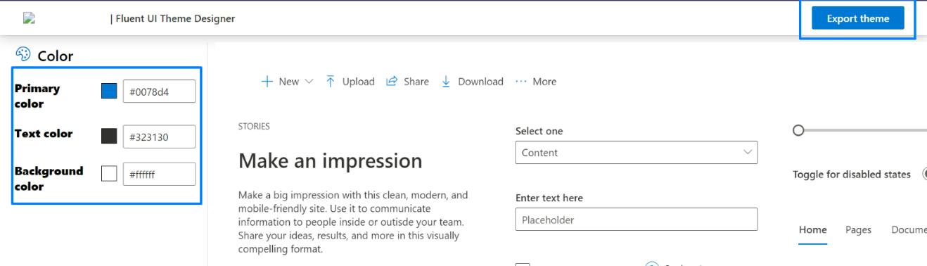
- To apply the theme settings, copy the JSON code and paste it into the designated area of the Theme Editor (Customize theme field). Click Save.
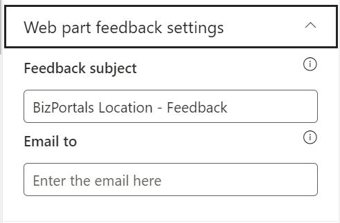
2.4 Web Part Feedback Settings
Feedback subject: This determines the subject line of the email sent when users submit any feedback related to the web part.
Email To: This field designates the recipient’s email address to whom feedback-related emails will be sent. When a user submits feedback through the web part, an email notification is generated and directed to the email address specified in this field.
Note: Feedback recipient must have access to this site collection.
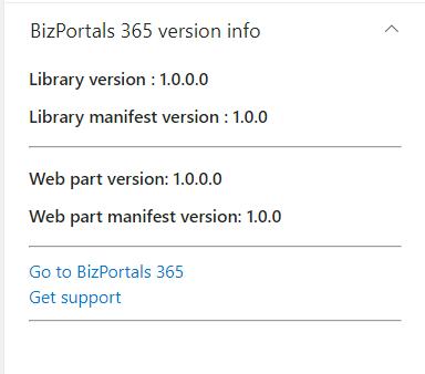
2.5 BizPortals 365 Version Info
Here user can see the version information.
3. Web part Functionality
Portal Administrators can set the location on any of the sites of the portal. Follow these steps:
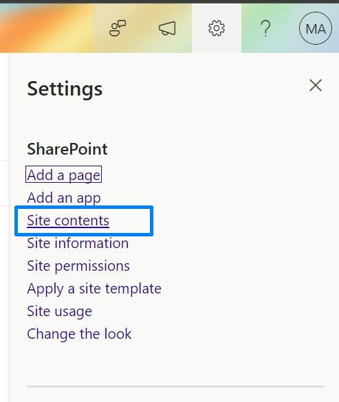
1. On the respective site, click the gear icon given at the top right corner of the page.
2. From the options, choose Site Contents.
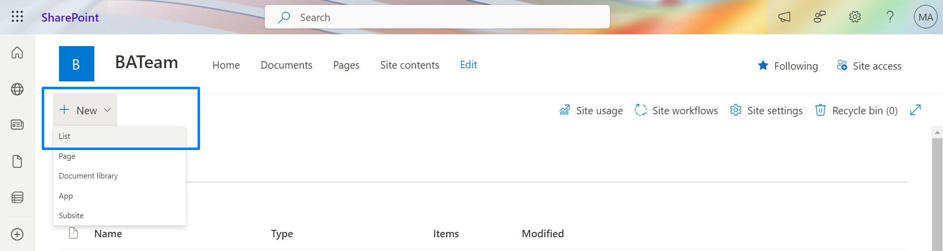
3. Create a new list by clicking the plus button (given at the top of the grid), choose list as the option, enter its name, and save it.
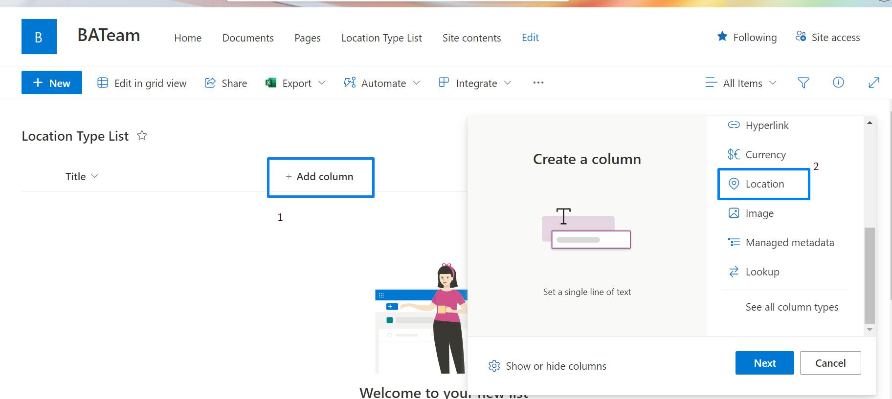
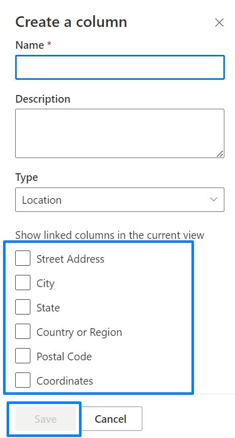
- To add a location type of column in the newly created list, click the plus button and choose Location as the type. Provide the details of the location column in the entry form and save this information.
- To add new location item in the list, click on new entry form by clicking on new option.