
BizPortals File Dropbox
BizPortals File Dropbox enables you to do the following:
- BizPortals File Dropbox simplifies the process of uploading files to different libraries on the portal through a single interface.
- It accommodates a wide range of document types, including MS Word, Excel, PowerPoint, PDFs, and image files.
- Quickly upload multiple documents by dragging them from your computer and dropping them into the web part.
- To execute the drag and drop action, choose the documents, drag them to the web part, and release them.
Upload Files:
- Quickly upload multiple documents by dragging them from your computer and dropping them into the web part.
- To execute the drag and drop action, choose the documents, drag them to the web part, and release them.
Notes:
- Only users with site owners or higher privileges can add new BizPortals File Dropbox webpart.
- Users with the “Member” permission level or higher can upload files. Conversely, visitors cannot upload any files.
- Site owners can choose to display header style/image by selecting the header layout in the webpart layout settings configuration.
2. Web part Configuration
2.1 Overview
You can change the title of this web part, add a description of the web part, change the layout, set the web part height, apply custom theme, show/hide the web part title and other configurations.
Note – You must have at least the site owner’s permission to configure this web part and site collection administrator permission to associate with new list.
Follow the steps mentioned below,
- Navigate to the top right corner of the page and click the edit button.
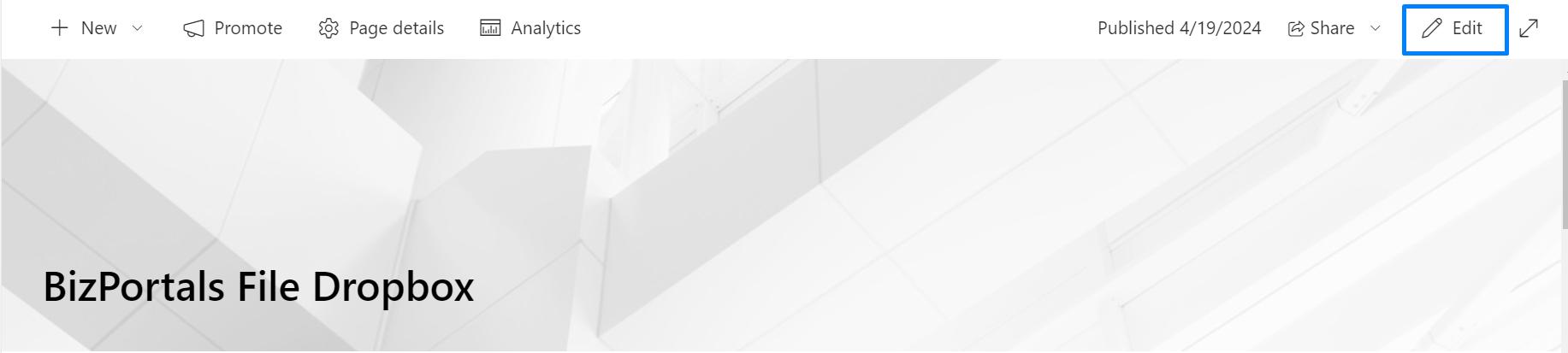
- Then click on the edit web part icon as shown in the below image.
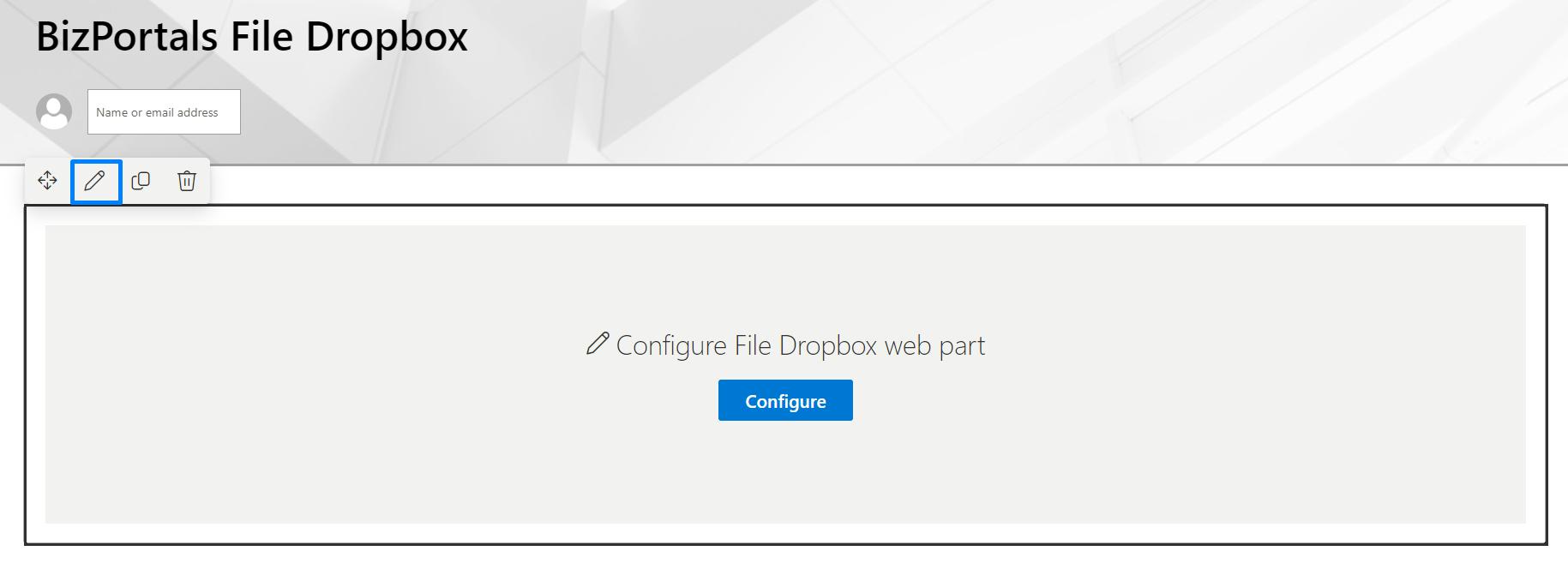
- After clicking on the edit web part icon, the property panel will be shown for this web part on the right side.
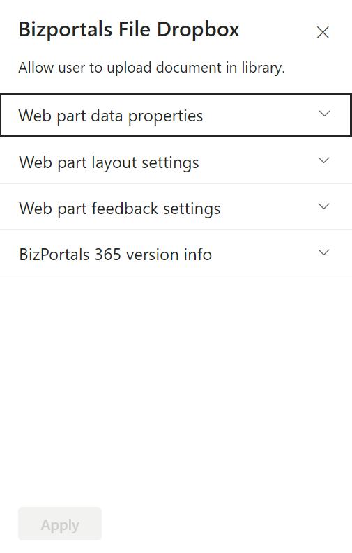
2.2 Web Part Data Properties
2.2.1 Web Part Title
It is the name that shows in the header of the web part that summarizes the web part’s function.
2.2.2 Web Part Description
This is the brief information related to the web part which can highlight what is the functionality of the web part.
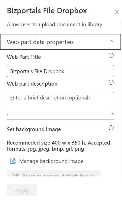
2.2.3 Set Background Image
It allows users to establish a background image on the web part display.
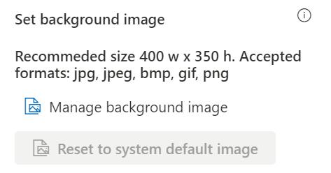
2.2.4 Reset to System Default Image
It provides users with the option to revert to the default background image specified by the system. This feature is useful when a user decides not to upload a custom background image in the “Set Default Image” field, allowing them to easily return to the system’s predefined default background.
2.2.5 Show Border
To display a border around the web part, users should activate the toggle button in the property pane. Once enabled, a 1pt border will be applied to the web part.
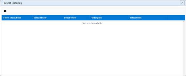
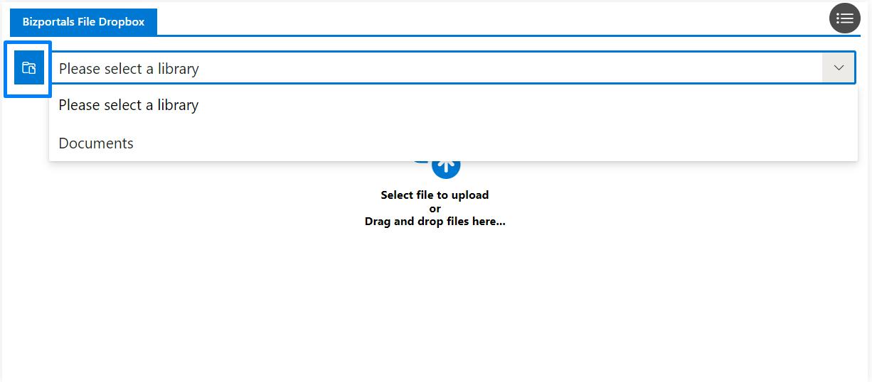
2.2.6 Configure Libraries
When we click on Add library, we can add multiple libraries, as shown in the below screen. Click on “+” icon to add new libraries.
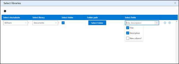
Select site/subsite: Choose/search a site from this option where you want to store the documents.
Select library: Choose library from this option where you want to upload documents.
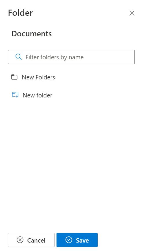
Select folder: Once selected, you have the option to either choose existing folders or create new ones to store your documents.

Select fields: Select fields from this menu, and the details associated with those fields will be displayed in the columns of the document library during the upload process.
Note: We can add multiple libraries and while uploading the documents we must select the library from web part display.
2.3 Web Part Layout Settings
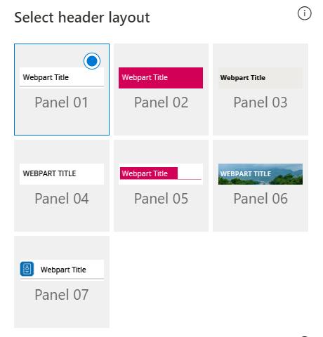
2.3.1 Select Header Layout
Users can change the web part header layout. There are several options to choose from. One option allows you to set an image in the web part title. When you select this option in the panel layout, a URL field will automatically appear next to the panel layout option. Users can enter an image URL to display on the panel. If you leave the field blank and click ‘Apply,’ it will use a default image.
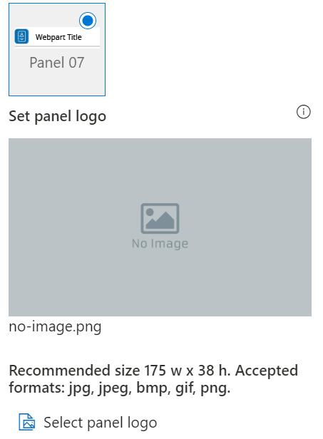
2.3.2 Set Panel Logo
In this feature user should be able to configure logo for web part header, the size for that image will be (175*38) as shown in the image below. User needs to select last panel layout to use this feature.
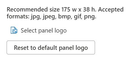
2.3.3 Reset to Default Panel Logo
It provides users with the option to revert to the default panel logo image specified by the system. This feature is useful when a user decides not to upload a custom logo image in the “Set panel logo” field, allowing them to easily return to the system’s predefined default background.
2.3.4 Display Web Part Title
Enable this toggle button if you want to display the title in the header of the web part. Keep this toggle button in disabled state if you want to hide the title in the header of the web part.
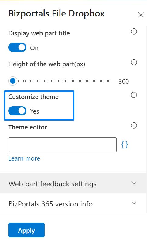
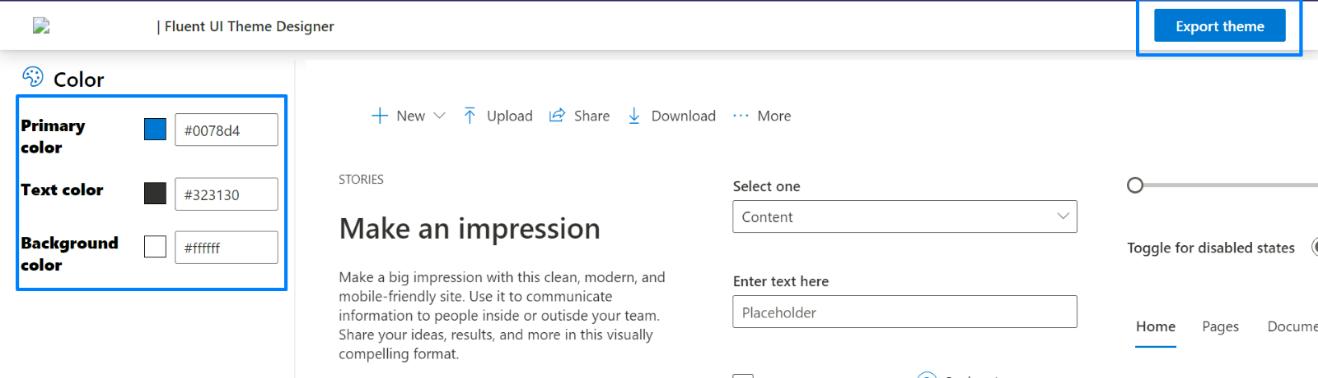
2.3.5 Customize Theme
Users can enable this option to personalize the web part’s visual appearance by applying a custom background theme. This is achieved by entering a JSON (JavaScript Object Notation) code into the theme editor as shown in below image. The JSON configuration includes parameters such as text color, background color, and other styling options to tailor the look and feel of the web part according to individual preferences.
- Click” Learn more” to visit the Fluent UI Theme Designer website.
- Customize your theme by selecting your preferred primary, text, and background colors. Once satisfied, click Export theme.
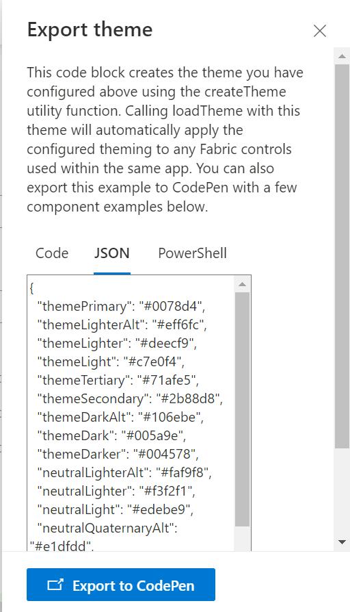
- To apply the theme settings, copy the JSON code and paste it into the designated area of the Theme Editor (Customize theme field). Click Save.
2.3.6 Web Part Height (px)
Users can set the web part height by sliding the range bar according to the requirement.
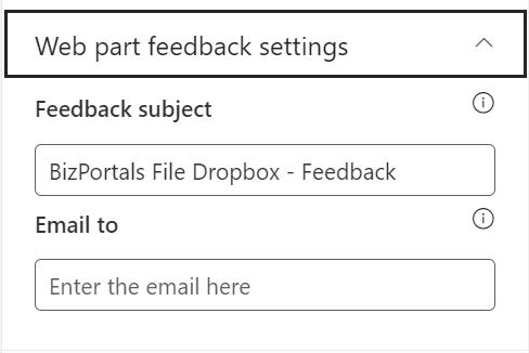
2.4 Web Part Feedback Settings
Feedback subject: This determines the subject line of the email sent when users submit any feedback related to the web part.
Email To: This field designates the recipient’s email address to whom feedback-related emails will be sent. When a user submits feedback through the web part, an email notification is generated and directed to the email address specified in this field.
Note: Feedback recipient must have access to this site collection.
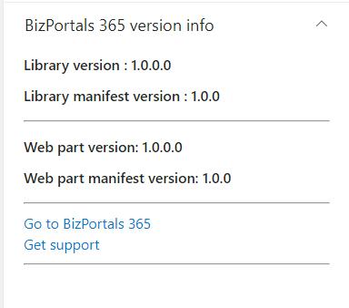
2.5 BizPortals 365 Version Info
Here user can see the version information.
3. Web part Functionality
3.1 Upload files
Users with site members and above permissions can do the following:
Files can be uploaded in one of the following ways:
Using the Upload button (as shown in below screenshot)
To upload a single document
- First select the library from show library button from web part display
- Click the upload icon.
- Navigate to the file’s location on your computer in the ensuing window.
- Select the desired file by clicking on it.
- Click the “Open” button within the window.
Note: Upon successful upload, a confirmation message will display on screen.

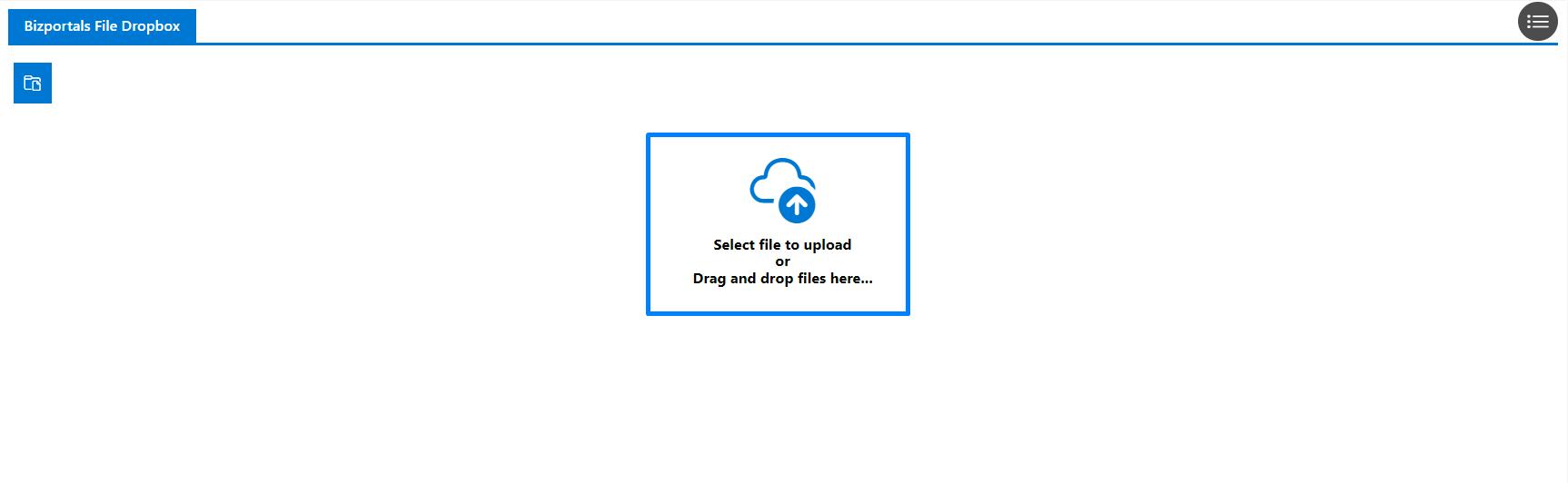
3.2 Upload using drag and drop
Upload single/multiple files for fast upload using drag and drop.
- Select your document(s).
- Drag them from your computer.
- Drop them into the web part.
- You’ll get a confirmation message on screen.
Note: When uploading documents to any library, if the custom property column is marked as mandatory, filling in all the fields is required for successful upload.
The column details will appear in the library column accordingly. Users are not permitted to upload documents without specifying mandatory field values.

In above image the custom properties feature is currently active, but it’s optional. If you opt for a library with custom properties, this screen will appear each time you upload something.