
BizPortals Employee Showcase
BizPortals Employee Showcase enables you to do the following:
- New Hiring: Displays the details of the employees who have been recently recruited by your company. Based on the “Employee hire date field”, and the “Job title” entered by the global administrators or user administrators, the details are displayed here. The Profile photo uploaded by the employee in the Azure AD are displayed here along with the name, the hiring date, and the designation. Further the Site Owners can specify to display new hire for previous weeks (up to 2 weeks). For example, if “Display new hire previous weeks” option is selected as 1 from the property pane by the site owners, then it shows employee hired in a period of last one week on the web part display. Likewise, if this is selected as 2, then it shows all the employee hired in a period of previous two weeks after any employee is hired.
- Work Anniversary: Based on the employee hire date entered by the global administrator or user administrator in the Azure AD, the information is shown on the web part display. The number of years completed by the employee is also displayed. The profile photo uploaded by the employee in the Delve Profile is displayed here along with the name, and the date.
- Employee Birthday: The birthdays of all the employees are displayed on the web part display. The number of days for the Birthday messages to be displayed can be changed by the Site Owners from the web part property pane. Based on this the Birthday messages are displayed. The birthdays are primarily picked from the user’s profile on Delve.
Notes:
- The layout of this web part may vary depending on the layout option applied by the owners.
- Only individuals who have access to this site will have their birthdays, work anniversaries, or new hire information displayed in the Employee Showcase.
2. Profile Picture Prerequisite
To display a user’s profile picture in the Employee Showcase web part, it is necessary to first update their profile picture in Azure AD. Please note sometime updated images may take up to 24 hours to appear on the webpart.
3. Web part Configuration
3.1 Overview
You can change the title of this web part, add a description of the web part, change the layout, set the web part height, apply custom theme, show/hide the web part title and other configurations.
Note – You must have minimum owner’s permission to configure this web part.
Follow the steps mentioned below,
- Navigate to the top right corner of the page and click the edit button.
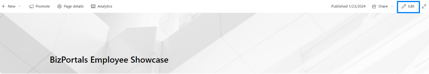
- Then click on the edit web part icon as shown in the above image.
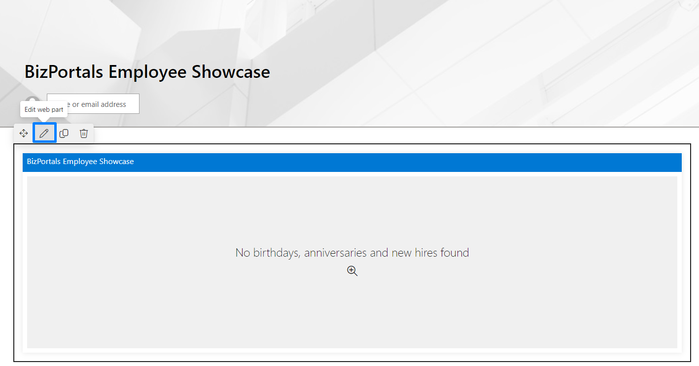
- After clicking on the edit web part icon, the property panel will be shown for this web part on the right side.
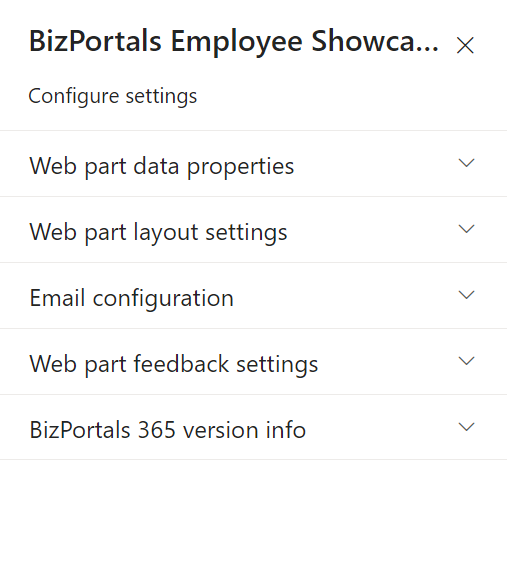
3.2 Web Part Data Properties
3.2.1 Web Part Title
It is the name that shows in the header of the web part that summarizes the web part’s function.
3.2.2 Web Part Description
This is the brief information related to the web part which can highlight what is the functionality of the web part and why it is there.
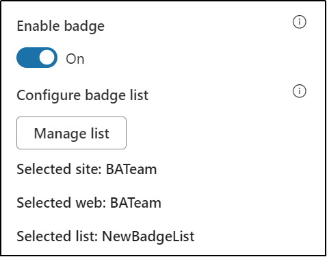
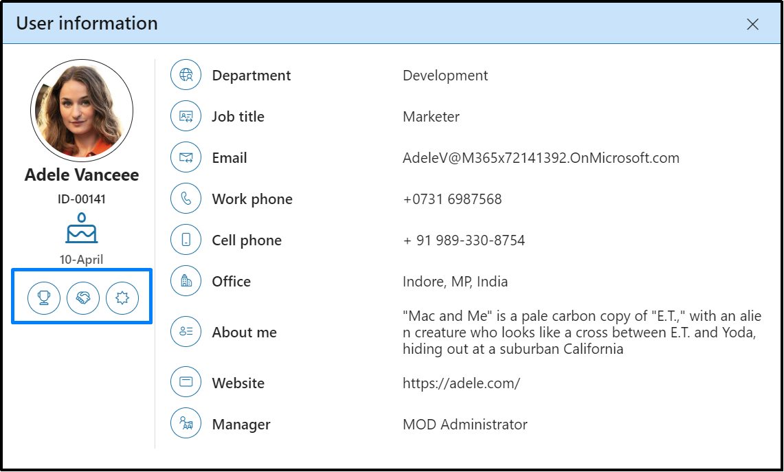
3.2.3 Enable badge
Users can enable this feature by switching the toggle button under Enable badge label
Users can see the counts of praises they have got if they hover mouse over the icons.
Note: This option is available only for Layout 2
3.2.4 Display birthdays for next (#days)
You can set the timeframe for which upcoming birthdays will be showcased on the web part display. This field is typically associated with a slider, allowing users to specify the number of days into the future for which they want to view upcoming birthdays.
Note: At max you can display employee birthdays before 30 days.
3.2.5 Display employee birthdays
Enable if you want the birthdays associated with the employees to be displayed in the Employee Showcase web part.
3.2.6 Display upcoming anniversaries (#weeks)
You can set the time frame for presenting information about future work anniversaries. The associated slider offers users a choice between two options, usually labelled as ‘1’ or ‘2’, indicating the number of upcoming weeks for which they want to view anniversaries.
3.2.7 Display previous anniversaries (#weeks)
You can set the time frame for presenting information about past anniversaries. The associated slider allows users to choose between two options, typically labelled as ‘1’ or ‘2’, indicating the number of weeks in the past for which they wish to view previous anniversaries.
3.2.8 Display work anniversaries
Enable if you want the work anniversaries associated with the employees to be displayed in the Employee Showcase web part.
3.2.9 Display new hires for previous (#weeks)
You can set the time frame for showcasing information about past new hires on the web part display. The associated slider offers users a choice between two options, usually labelled as ‘1’ or ‘2’, indicating the number of previous weeks for which they want to view new hirings.
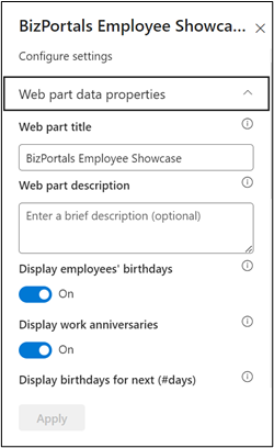
3.2.10 Display new hires
Enable if you want the details of the employees who have been recently recruited by your company to be displayed in the Employee Showcase web part.
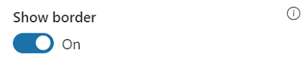
3.2.11 Show border
To display a border around the web part, users should activate the toggle button in the property pane. Once enabled, a 1pt border will be applied to the web part shown in the image below
3.3 Web Part Layout Settings
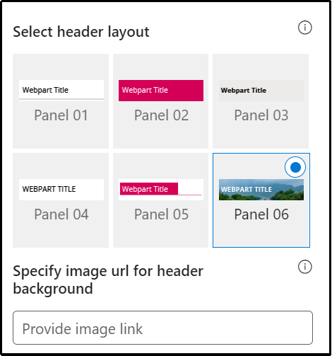
3.3.1 Select header Layout
Users can change the web part title layout. There are six options to choose from. The sixth option allows you to set an image in the web part title. When you select the sixth option in the panel layout, a URL field will automatically appear next to the panel layout option. Users can enter an image URL to display on the panel. If you leave the field blank and click ‘Apply,’ it will use a default image, as shown in the figure below.
When you select panel layout 7 user should be able to configure logo for web part header, the size for that image will be (175*38)
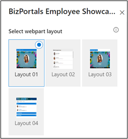
3.3.2 Select web part layout
It allows users to choose and customize the visual arrangement or structure of a web part.
3.3.3 Set duration (in milliseconds)
This field is tailored for carousel-type layouts (layout 1 and layout 3) within the Employee Showcase web part. Using a slider, users can define the time interval in milliseconds that elapses before a new entry is presented in the showcase.
3.3.4 Web Part Height (px)
Users can set the web part height by sliding the range bar according to the requirement.
3.3.5 Set default image
It is a feature within the Employee Showcase web part that enables users to designate a specific image as the default background. This selected image is then displayed behind the employee images in layout options 1 and 3.
3.3.6 Reset to system default image
It provides users with the option to revert to the default background image specified by the system. This feature is useful when a user decides not to upload a custom background image in the “Set Default Image” field, allowing them to easily return to the system’s predefined default background.
3.3.7 Image shape
It grants users the ability to determine the visual presentation of user images to be displayed on the web part. Users can decide whether they prefer the display of user images in a circular or square shape.
3.3.8 Display web part title
Enable this toggle button if you want to display the title in the header of the web part. Keep this toggle button in disabled state if you want to hide the title in the header of the web part.
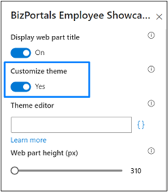
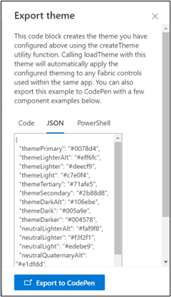
3.3.9 Customize Theme
Users can enable this option to personalize the web part’s visual appearance by applying a custom background theme. This is achieved by entering a JSON (JavaScript Object Notation) code into the theme editor as shown in below image. The JSON configuration includes parameters such as text color, background color, and other styling options to tailor the look and feel of the web part according to individual preferences.
- Click” Learn more” to visit the Fluent UI Theme Designer website
- Customize your theme by selecting your preferred primary, text, and background colors. Once satisfied, click Export theme.
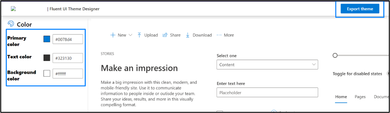
- To apply the theme settings, copy the JSON code and paste it into the designated area of the Theme Editor (Customize theme field). Click Save.
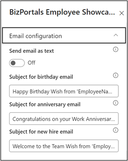
3.4 Email Configuration
Send email as text
Enable this feature to send email as a plain text format
Subject for birthday email: This field enables you to customize the subject line for emails sent when a user greets another employee on their birthday by clicking on the message icon near their name on the web part display.
Subject for anniversary email: This field allows you to set the subject line for emails sent when users greet their colleagues on work anniversaries by clicking on the message icon near their name on the web part display.
Subject for new hire email: This field lets you set the subject line for emails sent when users greet new hires by clicking on the message icon near their name on the web part display.
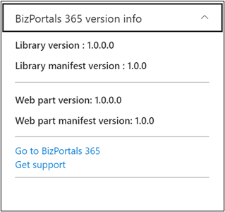
3.5 BizPortals 365 Version Info
Here user can see the version information.
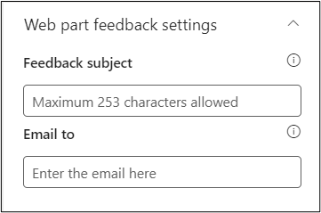
3.6 Web Part Feedback Settings
Feedback subject: This determines the subject line of the email sent when users submit any feedback related to the web part.
Email To: This field designates the recipient’s email address to whom feedback-related emails will be sent. When a user submits feedback through the web part, an email notification is generated and directed to the email address specified in this field.
Note: Feedback recipient must have access to this site collection.
4. Web part Functionality
4.1 Greet Users
- The Employee Showcase web part provides a convenient way for users to send personalized greetings to their colleagues on special occasions such as birthdays, work anniversaries, or new hires. The message icon allows users to initiate these greetings easily.
4.2 Sending a Greeting
4.2.1 Locate the Message Icon
Within the Employee Showcase web part, find the message icon associated with each employee’s profile.
- Click the Message Icon
Click on the message icon of the employee you want to send a greeting to. This action will open a pop-up text box for composing your message. - Default Greeting Message
A default greeting message may be pre-filled in the text box. This message is a generic greeting provided by the system, but you are free to customize it. - Send Your Greeting
Once you have crafted your message, click the “Send” button to dispatch your greeting. The message is sent to the user via email.
Note:
- The message icon for sending greetings is available only on the current day when the user is celebrating or after the event has passed. For upcoming highlights, the send icon will not be visible near their name until the day of the event.
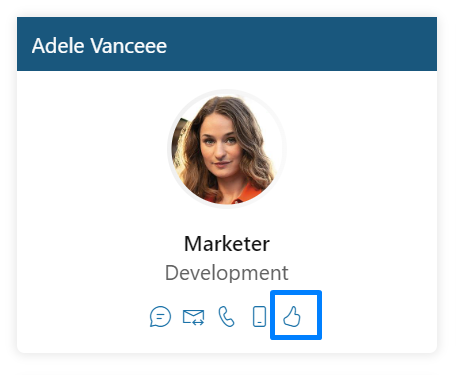
4.3 Praise Feature
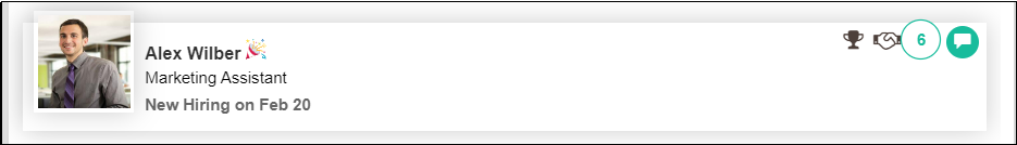
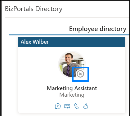
- The user will find an additional “Praise” feature in the BizPortals Employee Showcase web part layout 2 only
- Using this feature, users can assign a badge to an individual. Refer to the below image.
- Once the user clicks on the assign a badge, the below screen will be visible to them.
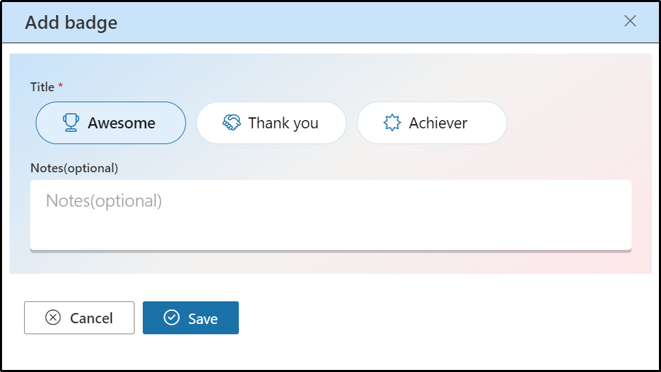
- Badge titles include Awesome, Thank You, Achiever. Uses can select any title, put their notes and click on Save.
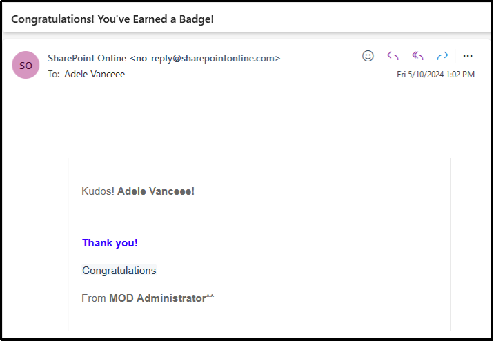
- Once the user clicks on the save button, an email notification will be sent to that user as per the screenshot below.
- Users will also see an increment in count number. Refer to the below image.
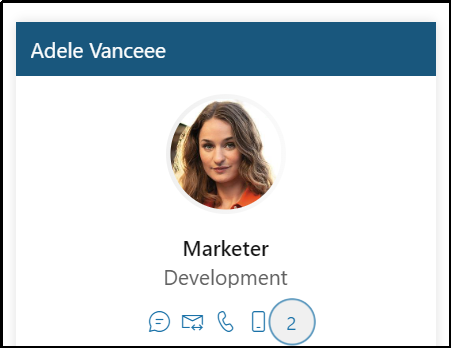
- Upon clicking on praise count, user will see a detailed card, with respective title badge counts. Refer to the below image.
Note:
- The users cannot praise themselves.
- One user can praise another user as many times as they want.